Liquid Glass Captions: The 2026 Viral Subtitle Style (And Why Most of Them Are Unreadable)
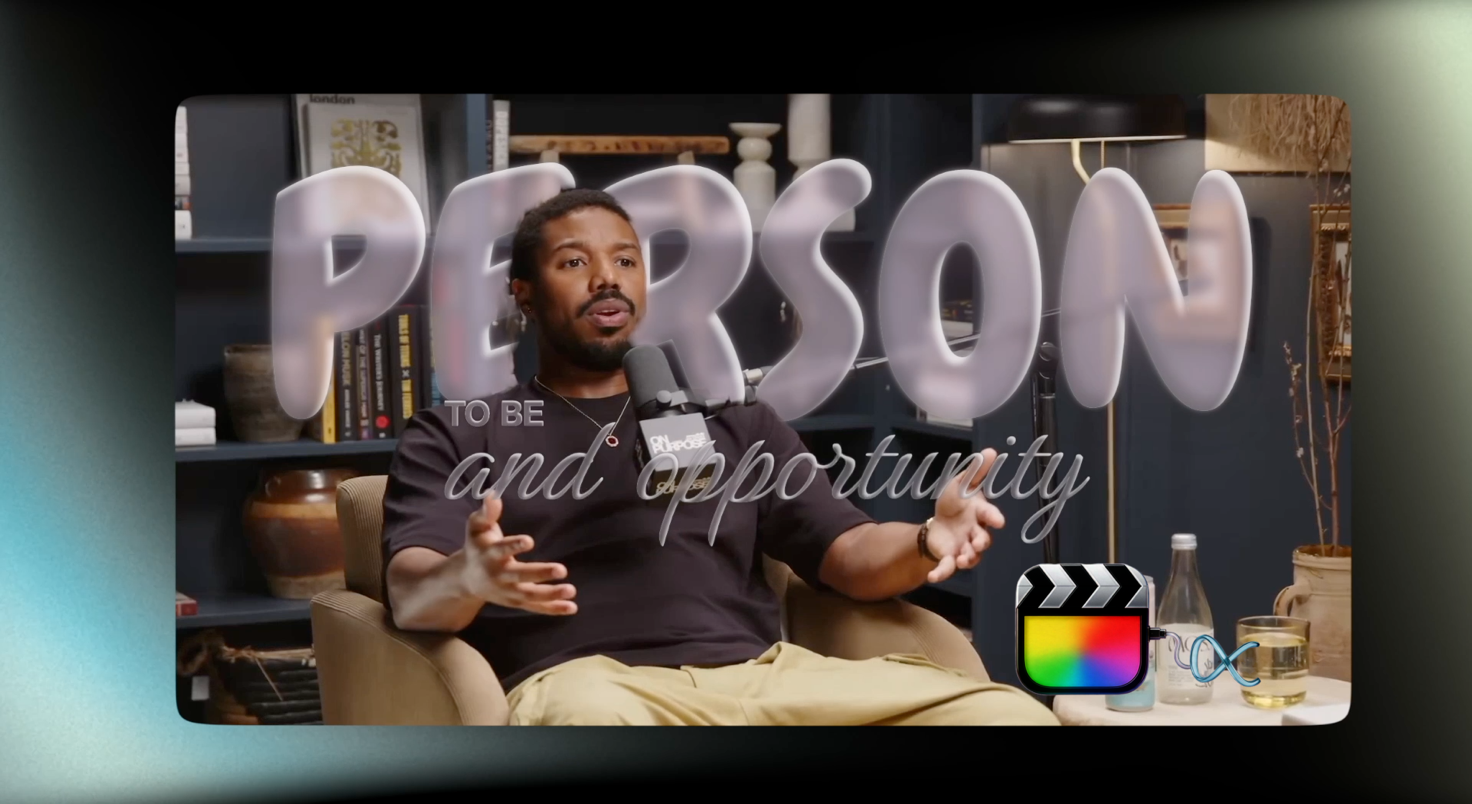
The caption looked incredible on your monitor. Frosted glass, soft refraction, the word swelling gently as it lands on the beat—the kind of thing that makes you sit back for a second and think yeah, that's the one. You export. You post it. Then you check it on your phone, outside, at three in the afternoon, and the word you spent twenty minutes styling has dissolved into the background like it was never there.
Everyone who has tried the liquid glass caption look has had this exact moment.
It's the most-copied subtitle style of 2026, and it's also the one most likely to fail on the device where your audience actually watches. That's not a reason to avoid it. It's a reason to understand what makes it work—because when glass captions are built correctly, nothing else on the feed looks like them.
What Liquid Glass Actually Is
The aesthetic didn't come from TikTok. It came from Apple. Liquid Glass was announced at WWDC on June 9, 2025, and it's Apple's most significant interface redesign since iOS 7. The idea is a material that behaves like real glass—translucent, refractive, catching light and bending what sits behind it, with specular highlights that shift as the device moves. Apple's designers literally fabricated glass samples at different opacities to match the interface to the physical thing.
It shipped across iOS 26, iPadOS 26, macOS Tahoe, tvOS 26, visionOS 26 and watchOS 26. If you want the full breakdown of how the material is constructed, Apple's Meet Liquid Glass session from WWDC25 is the primary source, and it's worth watching even if you never write a line of Swift. Understanding why the material reads as glass is what lets you fake it convincingly in a video editor.
Editors saw it, recognized it instantly as the visual language of every Apple device their audience owns, and started rebuilding it as captions. That's the whole origin story. The style feels premium because it's borrowing equity from an interface people touch four hours a day.
Why It Took Over Captions in 2026
Bold white text with a black outline still dominates short-form video, and for good reason—it's readable on anything. But it's also been the default since roughly 2019, and defaults stop getting noticed. Scroll for ninety seconds and you'll see the same caption treatment forty times.
Glass captions break that pattern without abandoning legibility, at least when they're done right. They sit in the frame as an object rather than a label. Light passes through them. They pick up the color of whatever's behind them, which means they feel composited into the shot instead of pasted on top of it.
What makes it useful: it signals production value in under a second. A viewer can't articulate why a glass caption looks more expensive than an outlined one, but they register it, and that registration buys you the extra beat of attention that decides whether they keep watching.
Why Most Glass Captions Are Unreadable
Now the part nobody selling you a preset pack will mention.
Apple had this exact problem. When Liquid Glass shipped in beta, reviewers reported that the transparency made text harder to read, particularly in high-contrast conditions like direct sunlight. The criticism was severe enough that Apple increased opacity in navigation bars and added transparency controls in subsequent releases. A company with the best design organization on earth, working on hardware it also builds, shipped a glass interface that was hard to read and had to walk it back.
So if your glass captions are turning to soup over busy footage, the problem isn't your taste. It's that translucency and legibility are in genuine tension, and resolving that tension takes deliberate work rather than a default setting.
Here's what actually goes wrong:
- Transparency set by feel on a bright, color-accurate monitor—then viewed on a phone at half brightness outdoors
- Glass placed over high-frequency detail (foliage, crowds, textured walls) where refraction has nothing clean to bend
- Blur radius too small, so the background reads through as noise instead of resolving into a soft field
- No edge definition—without a rim highlight, glass text has no silhouette and dissolves into whatever sits behind it
- Motion that never settles, leaving the eye no still moment in which to actually read the word
Every one of those is fixable. None of them is fixed automatically.
The Rules That Make Glass Captions Readable
Contrast first, aesthetics second. That ordering is the whole discipline. If a caption can't be read at a glance on a phone at partial brightness, its styling is irrelevant—nobody is admiring your refraction if they can't parse the word.
Give the glass something to sit on. A subtle darkened plate behind the text—barely perceptible as a shape—gives refraction a stable field to work against and stops the caption from competing with detail in the footage. This is precisely what Apple did when it raised opacity behind navigation elements. If it was the right call for them, it's the right call for you.
Define the edges. A thin specular rim along the top of each letterform is what separates glass from fog. It costs almost nothing visually and it's the single highest-impact adjustment on this list.
Let the word land. Animate in, then hold still. A caption that's still drifting when the next word arrives never gets read—it gets skipped, and a skipped caption is worse than no caption because it cost you frames and delivered nothing.
Best for: dialogue-driven footage with reasonably clean backgrounds—interviews, podcasts, talking-head content, product shots. Best avoided on chaotic handheld footage over busy environments, where high-contrast outlined text genuinely outperforms it. Our guide to free Final Cut Pro title templates covers the simpler treatments worth reaching for when the footage won't support glass.
And check it on a phone. Not scaled down in a viewer window—an actual phone, at the brightness people actually use, ideally outdoors. Ten seconds of checking catches problems that survive an entire grade.
Auto Subtitles and AI Subtitles: Get the Words Right First
Styling is the second problem. The first is having accurate, well-timed text to style, and no amount of glass rescues a caption that says the wrong word or lands half a second late.
Final Cut Pro's built-in Transcribe to Captions handles this natively and costs nothing beyond the app you own—it's genuinely good, and for clean English dialogue it's often all you need. The constraints are real, though: it's English-only, and it requires Apple silicon with a recent macOS. We walked through the whole feature in our guide to Final Cut Pro's AI transcribe to captions, including where it's strong and where it isn't.
Where AI subtitles pull ahead is messy audio—overlapping speakers, background noise, accents, technical vocabulary. Clean studio audio is a solved problem and every transcription engine handles it. The gap between tools only shows up on footage that sounds like the real world.
There's also a compliance dimension that's easy to ignore until it isn't. Automatically generated captions frequently fail WCAG 2.1 Level AA standards on accuracy and omitted sound cues—which matters if your work touches education, government, or any brand with an accessibility policy. Roughly 87% of Americans now use captions at least sometimes, and 80% of viewers say they're more likely to finish a video when captions are present. Accuracy isn't a checkbox. It's most of your audience.
That audience argument is the one editors consistently underrate, and we made the full case for it in why video captions are essential for SEO and engagement.
Building Glass Captions in Final Cut Pro Without the Round-Trip
You can construct this look manually. Duplicate your text, blur a background copy, mask it to the letterforms, add a rim highlight, animate the scale, then repeat for every caption in a three-minute video. It works. It also takes an afternoon, and it's the kind of task where the twentieth caption never gets the care the first one did.
The alternative is a caption plugin that treats glass as a style you apply rather than a composite you assemble. Caption Cut transcribes the audio, writes styled captions directly to your timeline, and keeps the whole process inside Final Cut Pro—no exporting audio, no SRT round-trip, no re-timing text a machine already timed correctly. We covered the full workflow in our breakdown of the caption plugin FCP editors keep using.
If you'd rather watch the workflow than read it, this walkthrough covers liquid glass captions and AI subtitles in Final Cut Pro end to end, along with several of the other modern caption styles.
Liquid glass captions and AI subtitles built directly in Final Cut Pro.
It isn't the only option, and pretending otherwise would be silly—FCP Cafe's plugin directory is the best map of the ecosystem, and we maintain our own roundup of Final Cut Pro caption extensions and plugins for comparing them properly. The honest filter is volume: at one video a month, build it by hand. At three a week, the math stops being close.
The same idea applies to the styles built on top of glass. This short shows Magic mode applying a full caption pass in Final Cut Pro with the Caption Cut Pro plugin—the whole run happens on the timeline, with no round-trip.
Magic mode applying styled captions in Final Cut Pro with the Caption Cut Pro plugin.
If you want to see how editors are actually using the style, it came up recently on Reddit's Final Cut Pro subreddit, and the ongoing conversation lives in the Caption Cut community subreddit where people trade presets and argue about blur radii. There's also a step-by-step liquid glass subtitle tutorial thread on r/fcpx walking through the build. You can also grab the plugin from the App Store listing for Caption Cut Pro or browse the full range on our download page.
The Short Version
Liquid glass captions are the most distinctive subtitle style available in 2026, and they're the easiest to get wrong. The look comes from a real design language Apple shipped across every one of its platforms—and Apple's own struggle with legibility is the clearest possible evidence that translucency needs deliberate handling rather than a default preset.
Get the transcription accurate. Give the glass a surface to sit on. Define the edges. Let the words hold still long enough to be read. Then check it on a phone in daylight, because that's where your audience is watching and that's the only test that counts.
Do that, and you get captions that look like nothing else on the feed while still doing the one job a caption exists to do. Skip it, and you get a beautiful shape nobody can read. The difference is about ten minutes of attention—and if you want to see the styling controls that make it repeatable, they're on the Caption Cut Pro page.
Ready to Transform Your Video Workflow?
Join thousands of video professionals using Caption Cut Pro to create professional captions in minutes.
Download on App Store